March 26, 2024
Forgotten art of status bar design


The status bar, right after loading / error states, might be the most overlooked mobile app UI element. Despite its apparent simplicity, it serves the crucial function of keeping users informed about essential device statuses. Achieving its optimal design needs more planning than the one might think.
A true cross platform
Once we acknowledge the significance of the status bar, the next step is determining its appearance. From the react native developer perspective, for a particular app screen the decision is not too complicated and it boils down to addressing those 3 general questions:
- Should we display the status bar icons at all?
- What color scheme should be used for the bar icons (dark or light)?
- Do we aim to maintain a consistent UX across both platforms?
While the first two questions may seem straightforward, they come with not that obvious design challenges, which I’ll try to elaborate on in a minute. However, the answer for last question is most likely a resounding “YES”.
In React Native we control the status bar with StatusBar component. Whatever our next plans might be, I’d start status bar management by handling it’s appearance with a simple app-specific status bar component:
const AppStatusBar: React.FC<AppStatusBarProps> = () => {return (<StatusBar...translucentbackgroundColor="transparent"/>)}
These two Android specific props are required for rendering our components beneath the status bar while ensuring their visibility. Even if your specific design doesn’t need such features, aligning with this default behaviour on iOS is advisable. Addressing this minor difference upfront can mitigate potential issues in further development, such as positioning elements close to the top edge of device’s screen.
It pays off to have it fixed straight away in a single place in your codebase.
Splash screen
Another place where I tend to see slips in perfection is the splash screen. Again this is rather a story of making some slight Android adjustments, but this time it is required to fiddle a bit with native files. While this part might depend on your specific splash screen implementation, it’s important to consider the status bar appearance during the app loading phase. It’s not that uncommon to see some grey cut off strips or jumpy transitions into the goal status bar right after the app loads. To me, although it’s a very short time that our user sees it, it might undermine the whole initial impression of app robustness.
Ideally, the status bar’s color should blend with the splash screen content, transitioning seamlessly into the initial app screen.
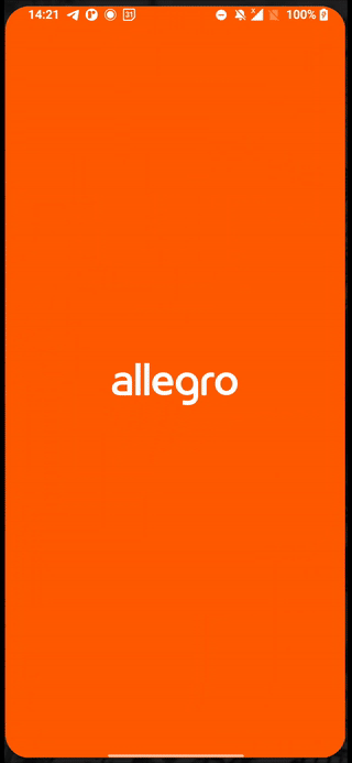
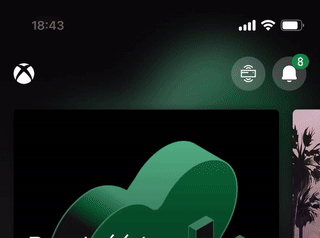
An example of splash screen status bar done right - allegro app.
This approach, consistent with our standard practises, has found its way into our React Native Redbeard app template.
Placement: root or screen
With our custom AppStatusBar in place, another question arises: Where should I put it?
So I’ve seen two schools for that:
- explicit placement on each screen
- root level placement + wherever you need a different look
The former approach seems to me marginally more proper, just because I perceive the status bar as a part of a screen. Explicit per screen placement makes it more predictable and obvious where to eventually make a code change.
The latter approach make much sense, if you don’t need to change the status bar appearance frequently. If your design doesn’t include light / dark screen variations, it’s totally possible, to handle it with a single root level implementation and forget about it.
Regardless of approach taken, beware of a common pitfall. The status bar's appearance corresponds to whatever <StatusBar /> component got rendered last. This caveat may lead to a situation like this:
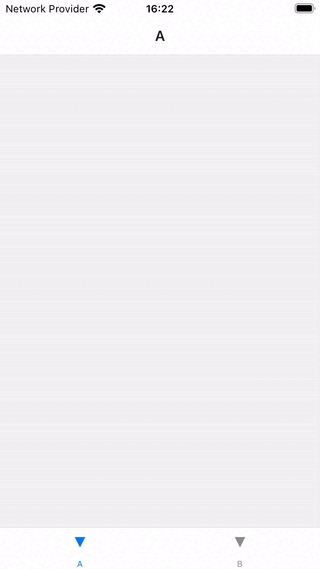
Both screens A and B feature different looking <StatusBar /> components. Because this navigator lazy loads each screen and won’t unmount it on leave, the status bar retains the appearance from the last screen we visit for the first time. In this case it's screen B with light text in status bar which renders unreadable on screen A.
In such scenarios, it might be better to leverage the imperative API exposed with StatusBar component static methods.
useFocusEffect(useCallback(() => {StatusBar.setBarStyle('dark-content');}, []),);
This little snippet ensures the appropriate bar style whenever the screen gains focus. Just be careful not to mix those two APIs for the same properties to prevent unexpected style overrides.
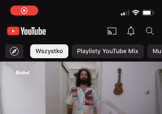
Scroll view
It seems intuitive to sync the status bar with the system dark / light mode setting, but in practise this is just a nice to have, but also an easy to avoid feature. Usually problems with status bar begin much earlier, before that “app polish” stage, where we add additional app themes - as soon as we introduce scrollable content.
The primary challenge around that is to ensure the proper content / background contrast, having only two bar styles to choose from. As users scroll (often through pictures) it’s easy to leave the top screen part unreadable.
How do we solve that?
Sticky top bar
This is the most common solution. Maintaining a persistent element, such as a search bar or a semi-transparent background, upon scrolling. Applying simple padding, rather than letting arbitrary content fly through the screen edge is a straightforward yet effective strategy.
const scrollY = useRef(new Animated.Value(0)).current;...<ScrollViewscrollEventThrottle={50}onScroll={Animated.event([{nativeEvent: {contentOffset: {y: scrollY,},},},])}/>
This is how the current scroll view position can be tracked. The scrollY value can be latter mapped to animate other elements as user scroll.
// top screen padding component, fading-in as user scroll<Animated.Viewstyle={{opacity: scrollX.interpolate({inputRange: [0,50,],outputRange: [0, 1],extrapolate: 'clamp',})}}/>
Gradient background


A more sophisticated solution would be to use a semitransparent gradient background that gives a little bit of extra contrast for the status bar content. This preserves the nice aesthetics of scrolling all the way to the top screen edge while maximizing the screen space utilization. We can modify our AppStatusBar using react-native-linear-gradient to achieve a similar effect
const AppStatusBar: React.FC<AppStatusBarProps> = () => {return (<LinearGradientcolors={['#2b2b2b', 'transparent']}style={[{height: 50, opacity: 0.15}, StyleSheet.absoluteFillObject]}><StatusBar...translucentbackgroundColor="transparent"/></LinearGradient>)}
I like this way a lot, although I imagine it’s not that universal. The shade would probably not look that good in other colours than black, so in my opinion it better fits the dark themed apps.
Disappearing status bar
This one is not that popular, but seeing it in leading apps makes it worth mentioning. Hiding status bar eliminates the risk of content overlap. It doesn’t have to be hidden all the time. In such a case we can also make it dependent on scroll offset.
const handleScroll = (e: NativeSyntheticEvent<NativeScrollEvent>) => {const {nativeEvent: {contentOffset: {y: scrollY},},} = e;StatusBar.setHidden(scrollY > 50);};(…)<ScrollViewscrollEventThrottle={50}onScroll={handleScroll}>(…)
While it works, I feel it’s kind of cheating. We’re actually sacrificing some features this way and I think it’s better to reserve this hide / show animations for more immersive context, such as gaming or full-screen media consumption.
Dynamic background brightness calculations

This one I find interesting, mainly becaue I haven't seen this doable. At least on iOS, it looks like we're able to pick the color for the left and right status bar content sides separately, based on the calculated background brightness.
I save it on the list as an extra. Based on my testing it didn't work that well. Some surfaces are just half-dark / half-light, and even the most accurate formula for calculations would fail such readability test. Not to mention that two-color status bar looks a bit odd.
Cool effect, but a bit over-engineered. I'd pass on that.
Animations
The StatusBar component supports some basic predefined animations via boolean animated prop. On Android, it ensures smooth color transitions between different backgroundColor values, while on iOS it adds an animation for hiding and altering the status bar content color (barStyle).
Those optional iOS animations are enabled by default on Android and remain unmodifiable, so I don’t see a reason to not make it more cross platform here as well and set this flag to true. With this adjustment, our true cross-platform status bar props count rounds up to three at minimum:
const AppStatusBar: React.FC<AppStatusBarProps> = () => {return (<StatusBar...animatedtranslucentbackgroundColor="transparent"/>)}
Want more?
If you liked this post, why don't you subscribe for more content? If you're as old-school as we are, you can just grab the RSS feed of this blog. Or enroll to the course described below!
Alternatively, if audio's more your thing why don't you subscribe to our podcast! We're still figuring out what it's going to be, but already quite a few episodes are waiting for you to check them out.


WRITTEN BY


More Brains and Beards stories


If you're a bit of a technical nerd (like us!) you can keep on reading. This site has been built in React, using GatsbyJS. The data layer is managed through GraphQL. The whole thing is hosted using Netlify. All of those products are great and we're so happy to be able to use them 💯❤️🚀