September 09, 2025
Building a Reusable Animated Button in React Native


Why Build a Custom Button?
When building apps in React Native having a consistent and polished button component is crucial for enhancing the user experience. While there are many UI libraries available, building your own button component gives you complete control over its behavior, animations, and styling.

In this post, we'll create a reusable NiceButton component that:
- provides smooth press feedback with scale and opacity animations
- supports multiple states (active, disabled, loading)
- displays a loading spinner next to the text
- uses React Native's built-in components and Reanimated for animations
- is easy to customize and maintain
Building from Scratch
Let's start by creating a basic button component using React Native's Pressable. The Pressable component is perfect for our needs as it provides more control over touch interactions than the basic TouchableOpacity.

import { Pressable, StyleSheet, Text, View } from 'react-native';interface NiceButtonProps {onPress?: () => void;title: string;icon?: React.ReactNode;}const NiceButton = ({ onPress, title, icon }: NiceButtonProps) => {return (<Pressable onPress={onPress}><View style={[styles.button, styles.buttonContent]}>{icon && icon}<Text style={styles.text}>{title}</Text></View></Pressable>);};const styles = StyleSheet.create({button: {paddingVertical: 14,paddingHorizontal: 28,borderRadius: 8,backgroundColor: '#007AFF',},buttonContent: {flexDirection: 'row',justifyContent: 'center',alignItems: 'center',gap: 12,},text: {fontSize: 16,fontWeight: '600',color: 'white',},});
This gives us a basic button with a clean, modern look.
Adding Press Animation
Now, let's enhance our button with a satisfying press animation using react-native-reanimated. We'll use a SharedValue to track the press state and animate both scale and opacity.
Button being pressed with scale and opacity animations.
import Animated, {useAnimatedStyle,useSharedValue,withSpring,} from 'react-native-reanimated';const NiceButton = ({ onPress, title, icon }: NiceButtonProps) => {const pressAnim = useSharedValue(1);const animatedStyle = useAnimatedStyle(() => ({transform: [{ scale: pressAnim.value }],opacity: pressAnim.value ** 4,}));const onPressIn = () => {pressAnim.value = withSpring(0.96);};const onPressOut = () => {pressAnim.value = withSpring(1);};return (<Pressable onPressIn={onPressIn} onPressOut={onPressOut} onPress={onPress}><Animated.View style={[styles.button, styles.buttonContent, animatedStyle]}>{icon && icon}<Text style={styles.text}>{title}</Text></Animated.View></Pressable>);};
The pressAnim value controls both the scale and opacity of the button. We use withSpring for a natural, bouncy feel when pressing and releasing.
Supporting Different States
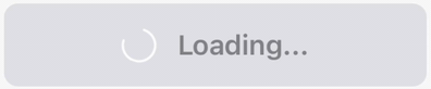
A good button component should handle different states gracefully. Let's add support for disabled and loading states.
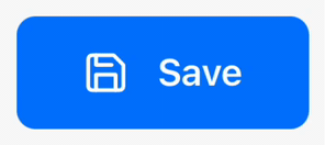
Button showing different states with smooth color transitions.
type ButtonStatus = 'default' | 'disabled' | 'loading';interface NiceButtonProps {status: ButtonStatus;onPress?: () => void;title: string;loadingTitle?: string;icon?: React.ReactNode;loadingIcon?: React.ReactNode;style?: any;}const NiceButton = ({status,onPress,title,loadingTitle,icon,loadingIcon,style}: NiceButtonProps) => {const pressAnim = useSharedValue(1);const stateAnim = useSharedValue(0);const animatedStyle = useAnimatedStyle(() => ({transform: [{ scale: pressAnim.value }],opacity: pressAnim.value ** 4,backgroundColor: interpolateColor(stateAnim.value,[0, 1],['#007AFF', '#E5E5EA']),}));const textAnimatedStyle = useAnimatedStyle(() => ({color: interpolateColor(stateAnim.value,[0, 1],['white', '#8E8E93']),}));useEffect(() => {stateAnim.value = withTiming(status === 'default' ? 0 : 1, {duration: 300,});}, [status]);const isPressable = status === 'default';return (<PressableonPressIn={isPressable ? onPressIn : undefined}onPressOut={isPressable ? onPressOut : undefined}onPress={handlePress}disabled={!isPressable}><Animated.View style={[styles.button, animatedStyle, style]}><Animated.Text style={[styles.text, textAnimatedStyle]}>{status === 'loading' && loadingTitle ? loadingTitle : title}</Animated.Text></Animated.View></Pressable>);};
We use interpolateColor to smoothly transition between active and disabled states.
Adding Loading Animation
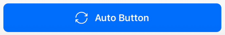
For the loading state, we'll add a spinning animation. We'll use withRepeat and withTiming to create a continuous rotation.
Button in loading state with spinning icon animation.
const NiceButton = ({status,onPress,title,loadingTitle,icon,loadingIcon,style}: NiceButtonProps) => {const rotation = useSharedValue(0);useEffect(() => {if (status === 'loading') {rotation.value = withRepeat(withSequence(withTiming(360, {duration: 1000,easing: Easing.linear,})),-1);} else {rotation.value = withTiming(0);}}, [status]);const spinnerStyle = useAnimatedStyle(() => ({transform: [{ rotate: `${rotation.value}deg` }],}));return (<Pressable><Animated.View style={[styles.button, animatedStyle, styles.buttonContent, style]}>{status === 'loading' && loadingIcon ? (<Animated.View style={spinnerStyle}>{loadingIcon}</Animated.View>) : icon ? (icon) : null}<Animated.Text style={[styles.text, textAnimatedStyle]}>{status === 'loading' && loadingTitle ? loadingTitle : title}</Animated.Text></Animated.View></Pressable>);};
The rotation animation will be applied to any icon we pass as loadingIcon. This gives us flexibility to use any icon library or custom component for the loading state.
Final Touches
Our NiceButton component is now complete with all the essential features. You can try it out in this Expo Snack.
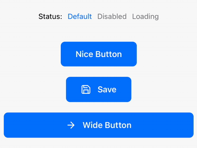
Complete button implementation with all states and animations.
The component is now ready to be used across your app, providing a consistent and polished user experience. For production use, you might want to consider adding haptic feedback using react-native-haptic-feedback.
Usage Example
Here's how to use the NiceButton in your app:
export default function HomeScreen() {const [status, setStatus] = useState<ButtonStatus>('default');return (<View style={styles.container}><NiceButtonstatus={status}onPress={() => console.log('Button pressed!')}title="Nice Button"/><NiceButtonstatus={status}onPress={() => console.log('Save pressed!')}title="Save"loadingTitle="Saving..."icon={<Feather name="save" size={20} color="white" />}loadingIcon={<AntDesign name="loading1" size={20} color="white" />}/><View style={styles.fullWidthButtonContainer}><NiceButtonstatus={status}onPress={() => console.log('Full Width Button pressed!')}icon={<Feather name="arrow-right" size={20} color="white" />}title="Wide Button"style={styles.fullWidthButton}/></View></View>);}const styles = StyleSheet.create({container: {flex: 1,justifyContent: 'center',alignItems: 'center',gap: 20,paddingHorizontal: 20,},fullWidthButtonContainer: {width: '100%',},fullWidthButton: {width: '100%',},});
The component is designed to be easily customizable through props and styles. You can extend it further by adding support for different sizes or custom animations. Remember to keep your button styles consistent across the app for the best user experience.
Conclusion
Building your own button component gives you full control over its behavior and appearance.
The NiceButton component we created provides a solid foundation that you can build upon. It handles different states gracefully and provides satisfying feedback to user interactions. Feel free to customize it further to match your app's design system.
Happy coding! 🚀
Want more?
If you liked this post, why don't you subscribe for more content? If you're as old-school as we are, you can just grab the RSS feed of this blog. Or enroll to the course described below!
Alternatively, if audio's more your thing why don't you subscribe to our podcast! We're still figuring out what it's going to be, but already quite a few episodes are waiting for you to check them out.


WRITTEN BY


More Brains and Beards stories


If you're a bit of a technical nerd (like us!) you can keep on reading. This site has been built in React, using GatsbyJS. The data layer is managed through GraphQL. The whole thing is hosted using Netlify. All of those products are great and we're so happy to be able to use them 💯❤️🚀